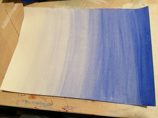
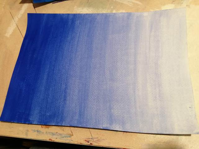
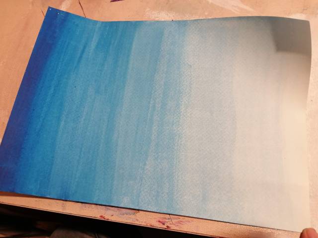
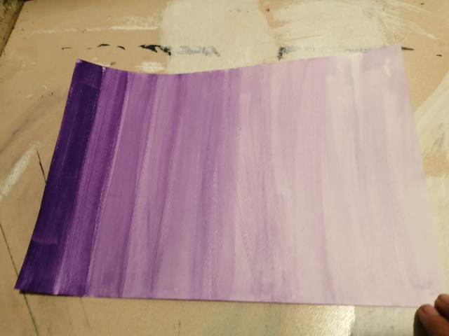
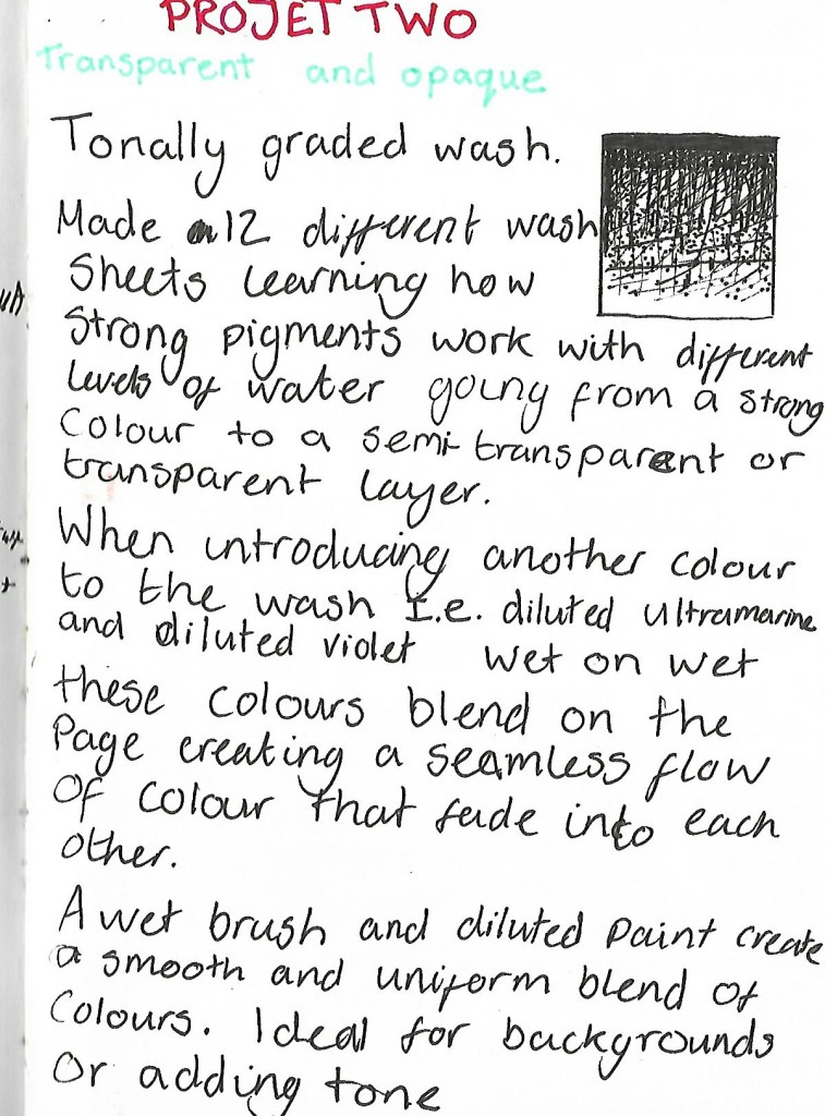
I started this project focusing on creating the transparent graded sheets, I chose to use strong pigmented colours; Ultramarine, Phthalo Green, Violet and to test colour difference Primary Blue. Creating the different levels of watery mixtures from a strong, vivid opaque colour, to semi-transparent, then to a transparent colour was informative.
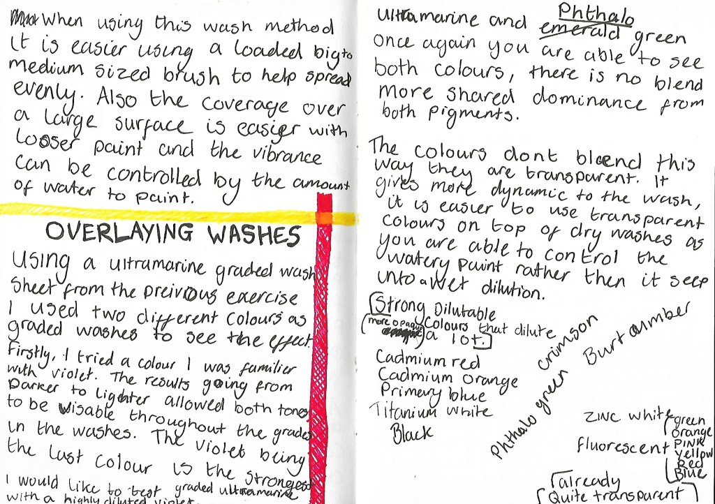
Overlaying washes – Using dried sheets from the previous exercise I tested violet & phthalo green as graded washes in the opposite direction this allowed me to see the strengths against their opposites and how different colours can react. Dry wash overlaying, does not let the colours blend rather it allows the layers to be seen.
Opaque
Cadmium red
Cadmium orange
Primary blue
Titanium White
Black
Crimson
Phthalo Green
Burnt Umber
Transparent
Zinc White
Fluorescent colours
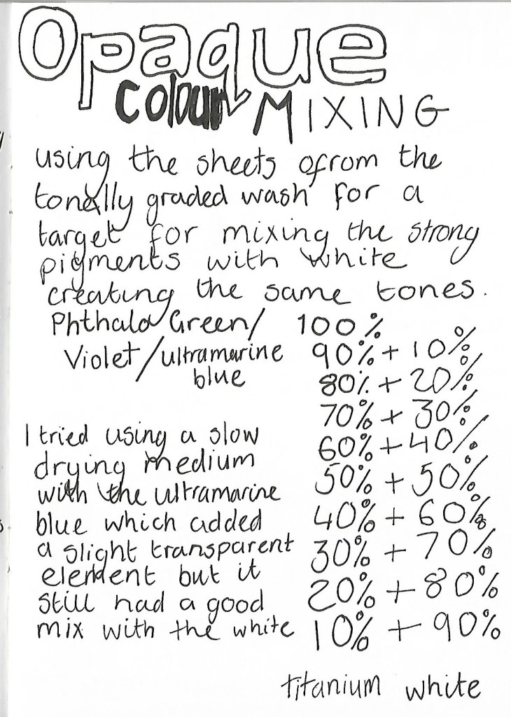
Creating the opaque tonal graded sheets, I used the same colours and transparent sheets as a reference. Starting with the strong colour first and working my way through the sheet mixing titanium white. The first sheet I tried began to dry while painting due to the thick pigment and lack of water so I tried mixing a slow drying medium to the next test. The results added a slight transparency to the tone. I found it a lot easier to complete the sheets with the medium. This allowed me to create weaker pigmented tones that still had strength in colour
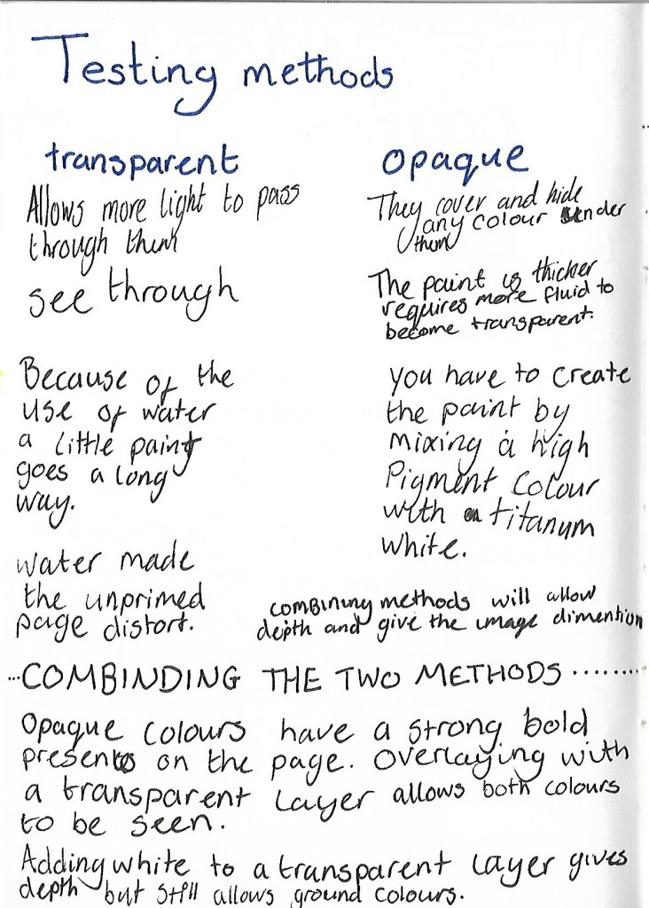
These two tasks really allowed me to see the strength of the paints and increased my level of control towards the paint. I will do this with every new brand of paint, to gain instant knowledge of the pigment.

