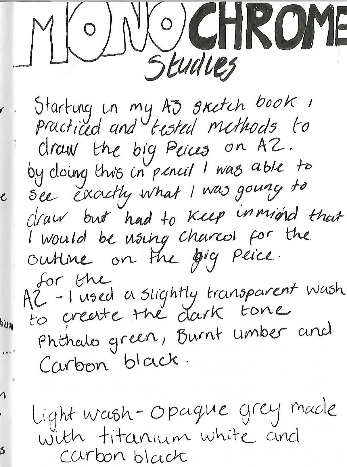
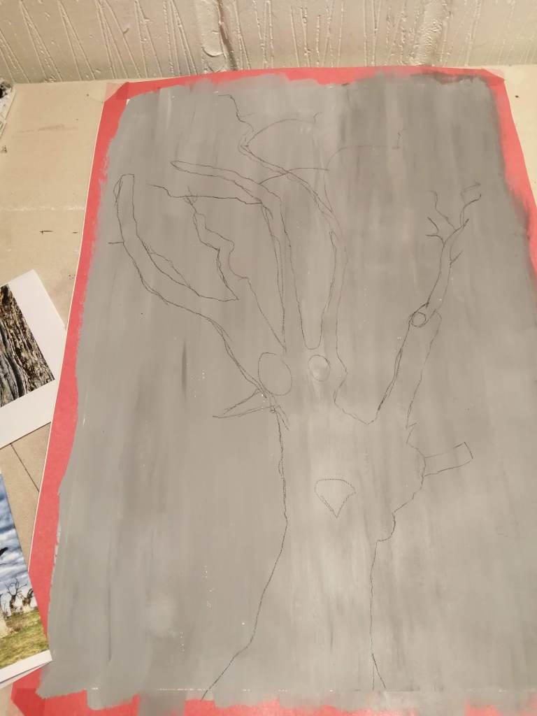
Starting in my A3 project sketchbook I tested methods of drawing the tree outlines, tested composition and evaluated different images. I then tested methods with paint in my sketchbook by gesso priming the pages before creating micro A5 versions to test the final results.
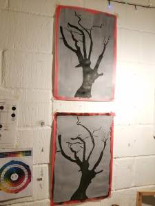
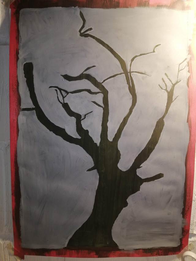
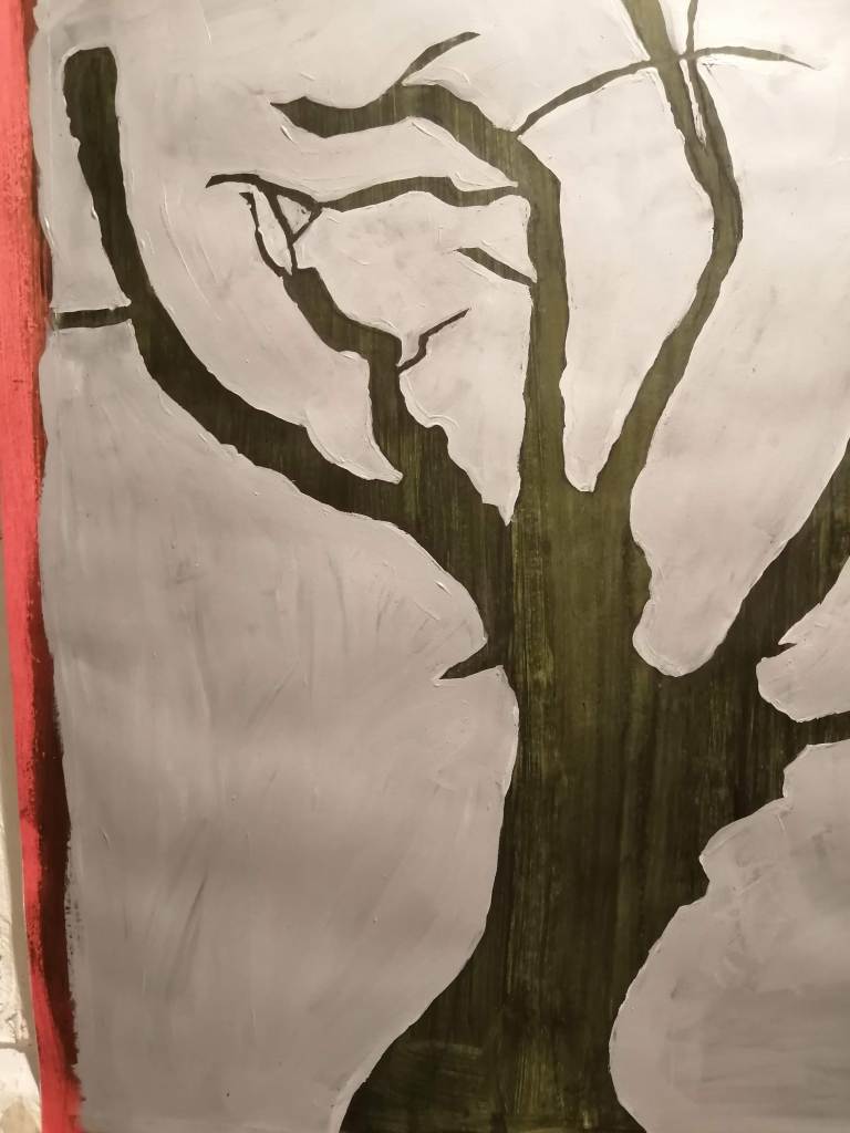
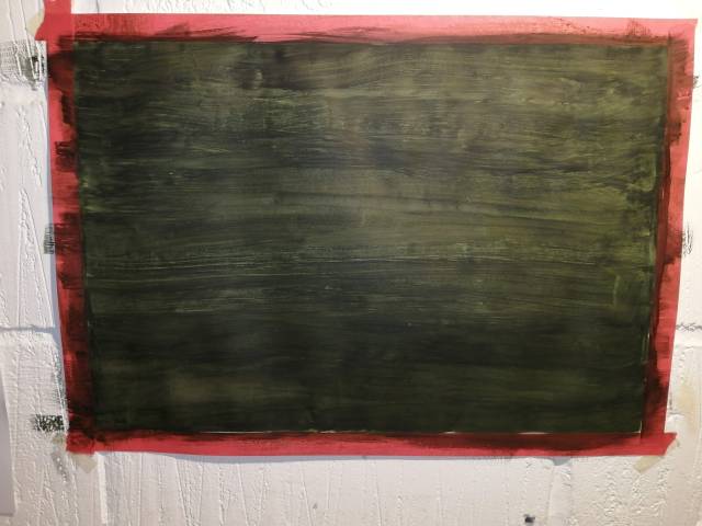
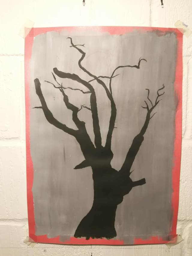
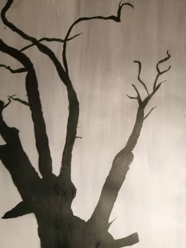
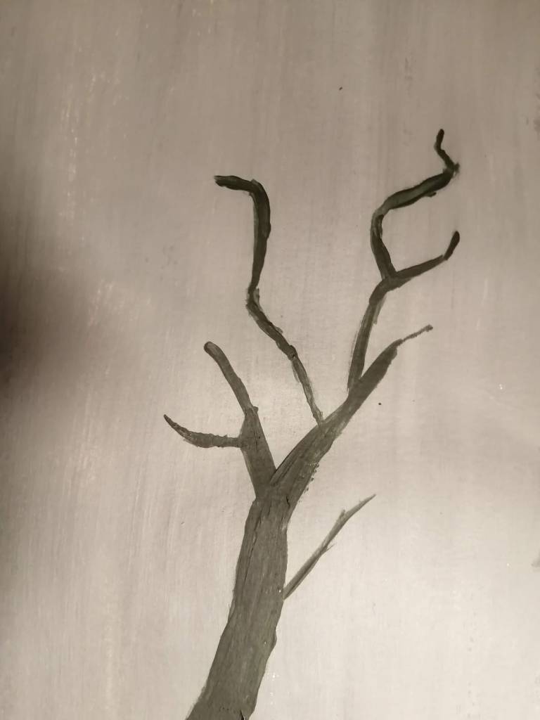
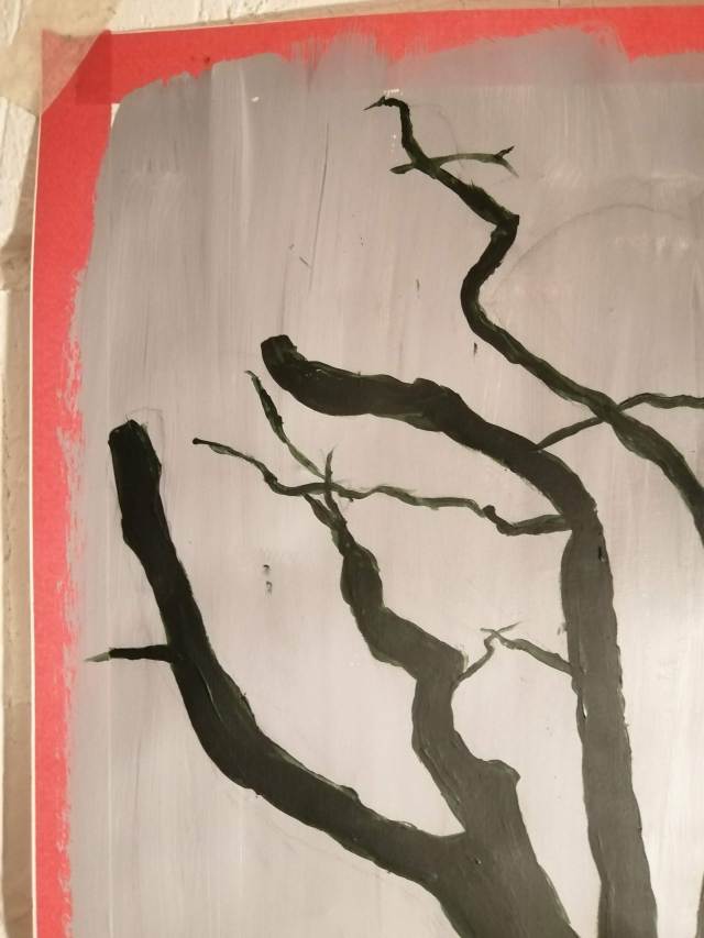
For the A2 piece the dark wash tone I created was a slightly transparent mix of phthalo green, burnt umber and carbon black
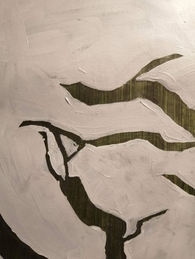

For the A2 light wash , I created a light opaque grey with titanium white and carbon black
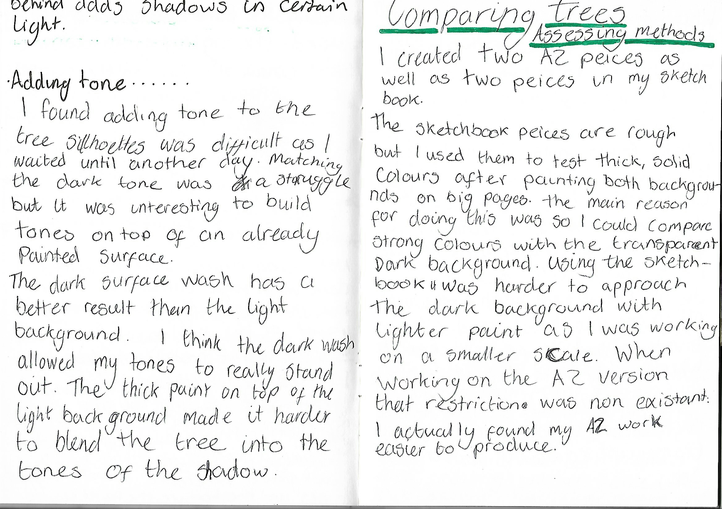
Adding tone
I found adding tone to the tree silhouettes was difficult as I had to match dry tones to wet paint. I really enjoyed building tones on top of dry paint once I eventually matched the tones. The dark wash allowed the tones to stand out. The thick paint on top of the light background made it harder to blend the tree into the tones of the shadow
Comparing trees, Assessing methods.
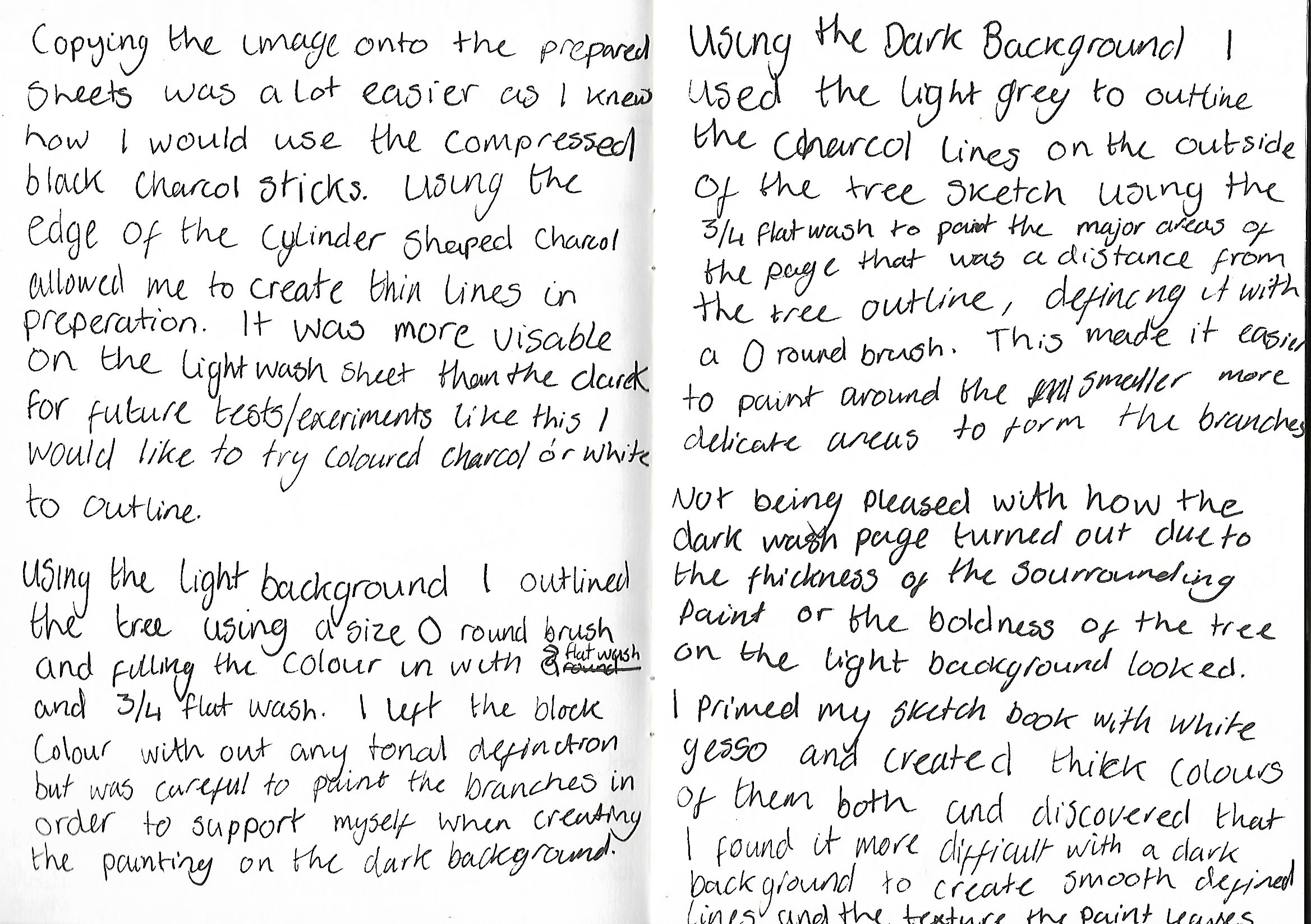
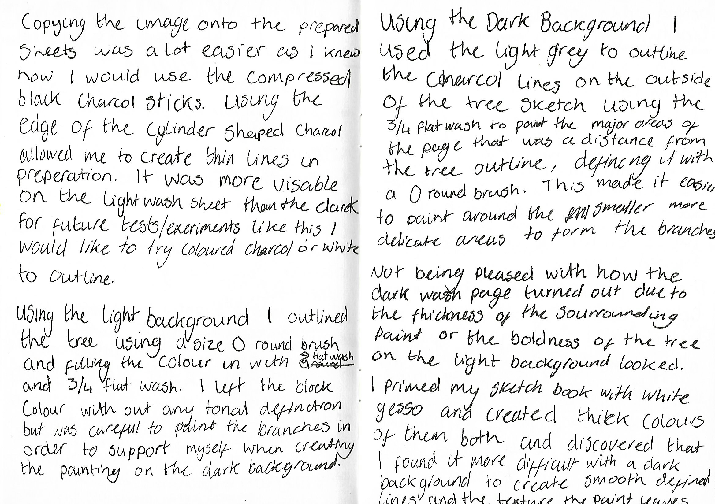
I used the sketchbook pieces are rough but I was able to test the thick and solid colours after painting the transparent A2 dark background. I did this to compare strong colours with the transparent dark background with lighter paint as I was working on a smaller scale. When working in the A2 version that restriction was non existent., I found the A2 work a lot easier to produce as the fine-lines could be done with an average small brush. I prepared the colours for the backgrounds and applied the paint leaving a smooth surface behind to create a easy surface to draw on with chalk. The chalk drawing made painting dark on to light a lot easier as I could paint directly with a small brush to create smooth branches. The transparent dark background allowed me to be able to really create shadows and tones that represent the tree, although I found it more difficult to define the smaller, wispy twigs from the tree. Reversing the techniques for the light washed piece, I used transparent paint on-top of the opaque tree outline allowed me to add tones and texture with the brush marks.
Strengths and weaknesses
- Using a transparent colour for a background allows layering to create more texture.
- Mixing a paint to a more fluid consistency allows for better definition
- Creating smooth edges and defined lines is easier (after painting main areas) with a smaller brush
- Transparent paint is harder to see on dark colours which made it difficult when painting on the light ground
Overall, I think I approached this task slightly bewildered and it took me a lot longer to complete then other work so far. I believe this is because of I found adding tones on each piece needed different techniques. Adding tone to the transparent background proved simpler as the surface was more textured and gave the image more body. The limitations of these monochrome techniques proved to be in the planning and analysing of the image. If I spent more time analysing the direction and shadow of the branches and bark.