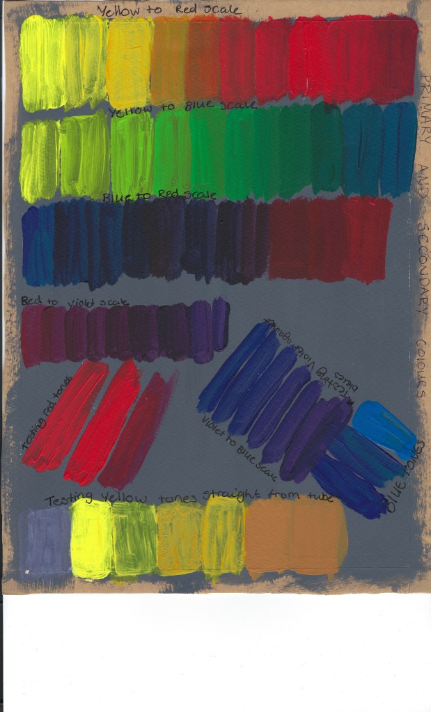
To figure out which colours I would be using for this test, I firstly did some individual colour testing with yellows (fluorescent yellow, lemon yellow, primary yellow, cadmium yellow hue, yellow orche and raw sienna), Reds (cadmium red, primary red and vermillion) Blues (Ultramarine, Cerulean blue and primary blue)
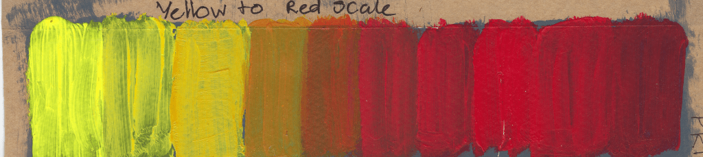
I then created a graded sequence between yellow and red
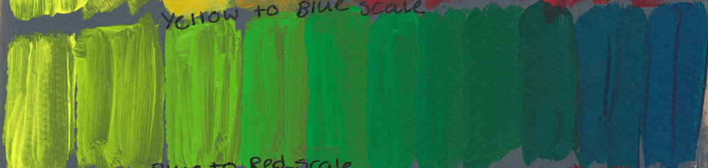
I next worked on the yellow to blue graded sequence.
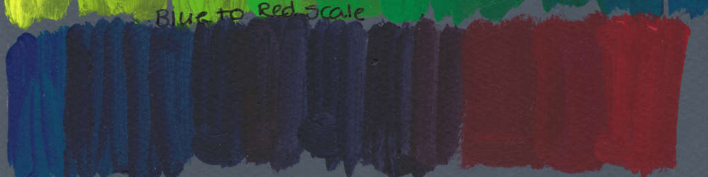
Blue to red tonal sequence
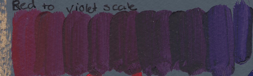
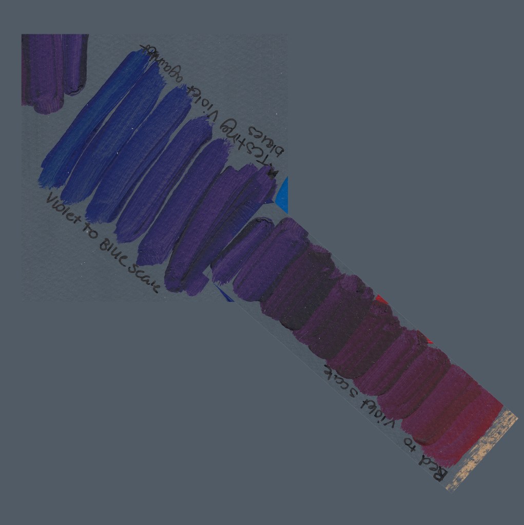
I created a red to violet scale to see how red blends with violet.
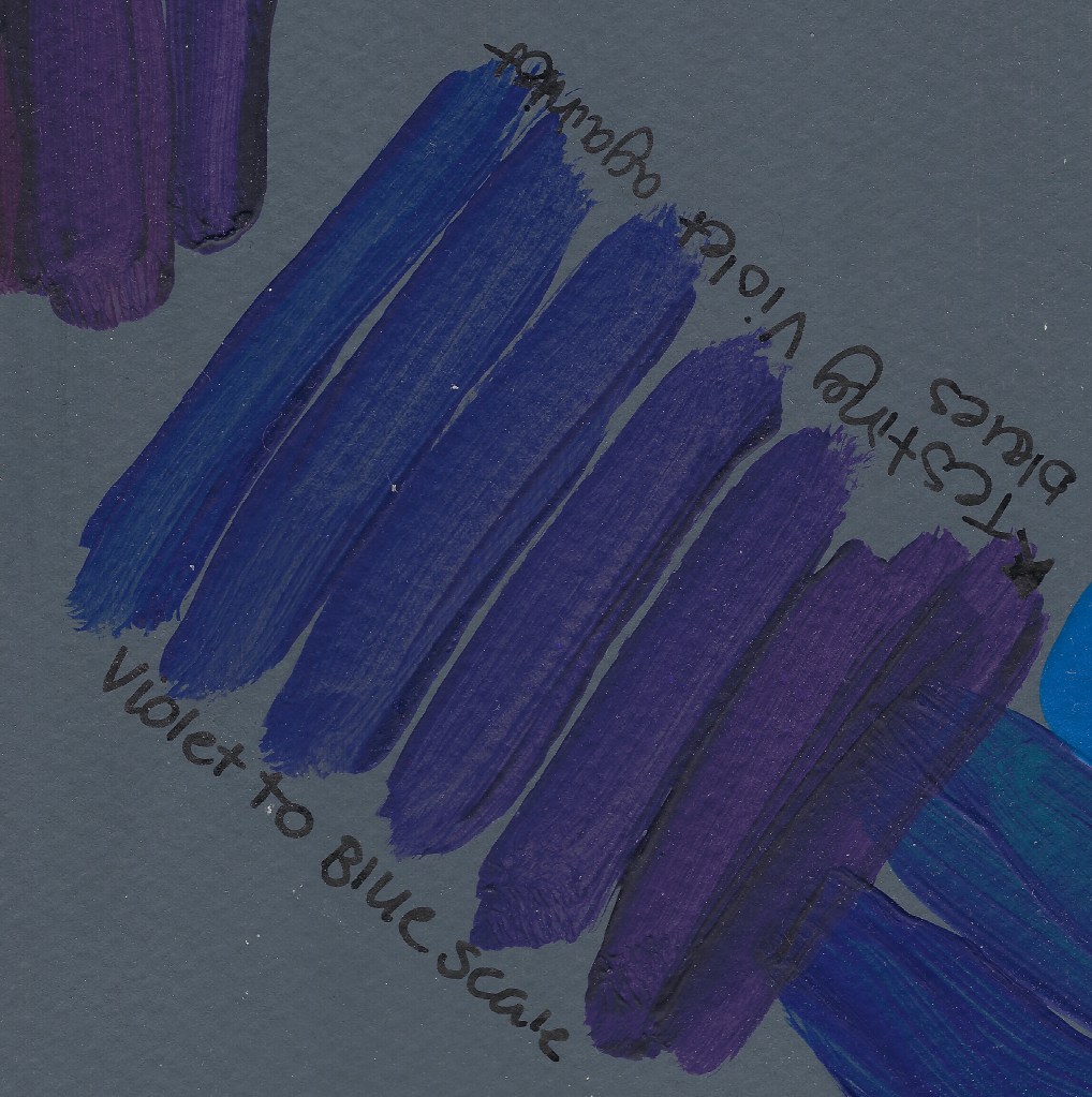
I then tested blue to violet
I have created a digital image of red to blue using violet
This tests allowed me to make a scale that represents the colour mixing sequence.
Conclusion and findings for this exercise
How thickly the paint is applied will affect the transparency and tone, some colours needed to have multiple coats to look their colour.
I am aware of how colours mix and understand when I need to adjust a colour.
