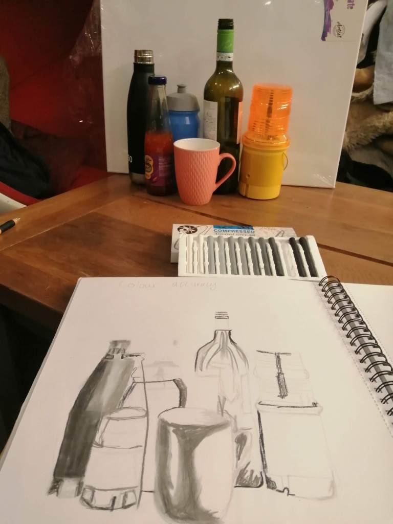
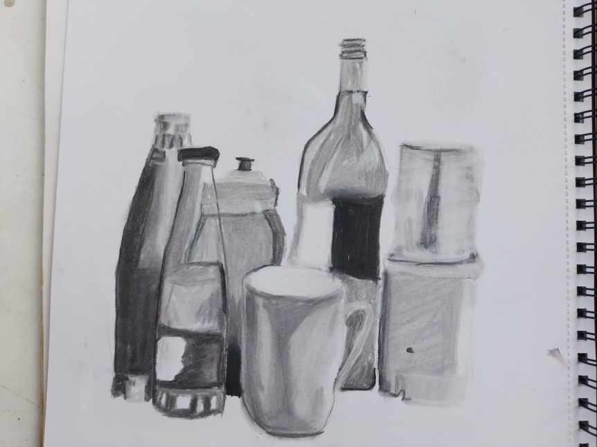
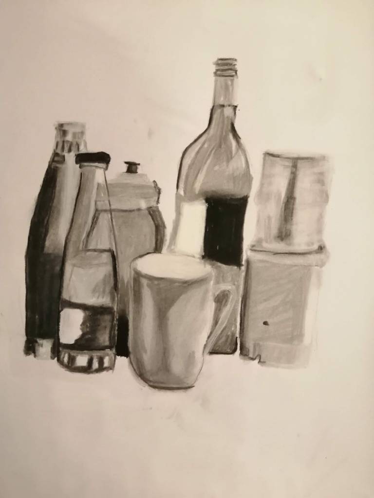
I first drew with compressed charcoal. I used a collection of white, light grey, medium dark grey, dark grey and black to create the image pictured above. This expresses the tonal value of my chosen subjects without focusing on the colours. I am able to see exactly where shadow lay or dominate in my arrangement of objects. Light tones in this images are caused by light reflection, labels and also help define my shapes, while the blacks help assess the darkest parts of the image and, allow me to explore how the objects overlay.
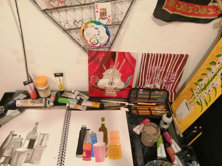
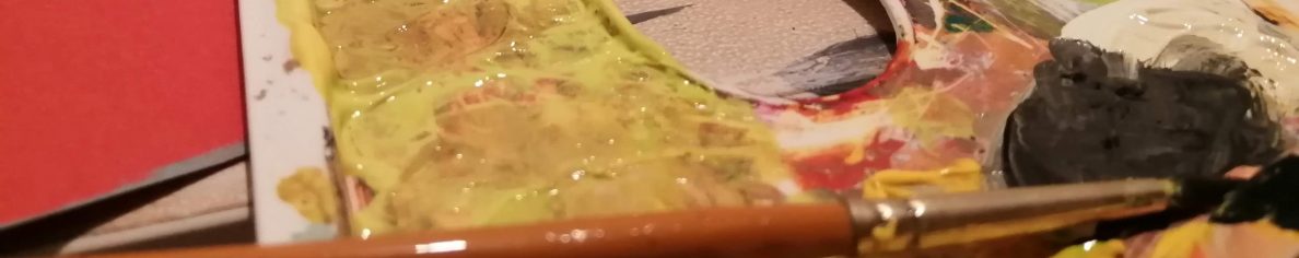
I drew an outline in light pencil lines and began painting yellows and the right hand side. I found myself into the painting and ended up painting almost the entire image.
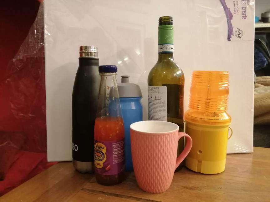
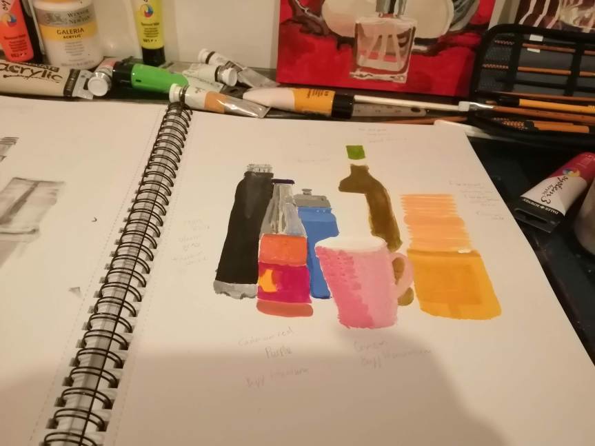
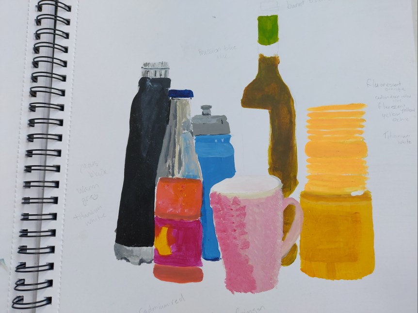
I found this image to be quite promising in showing my colour accuracy skills so have chosen to talk about this sketchbook painting over a final piece- Personally I am finding creating still life painting to be quite a draining process. I am not enjoying painting objects, which has really negatively affected my love for painting and my energy levels.
