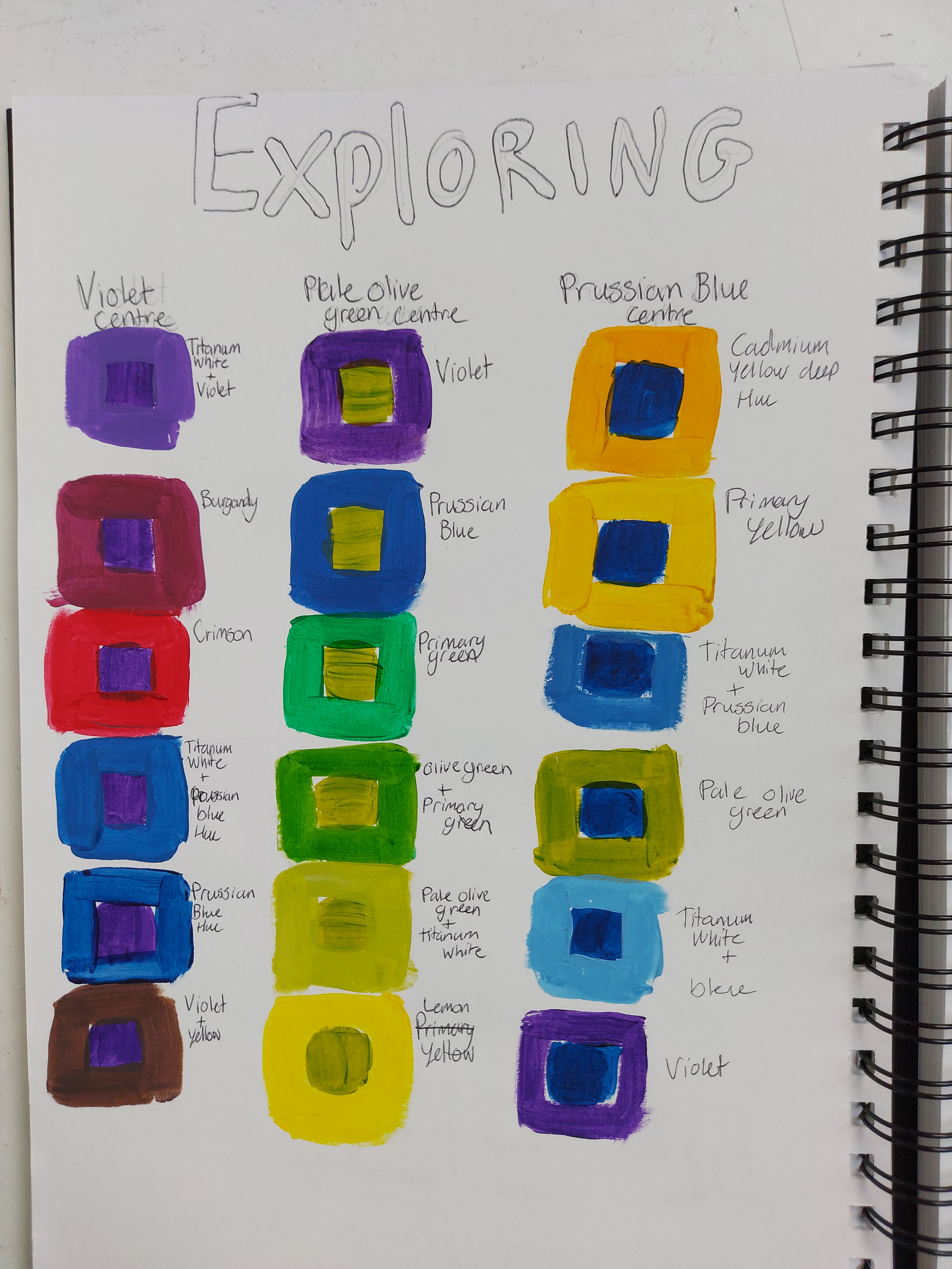
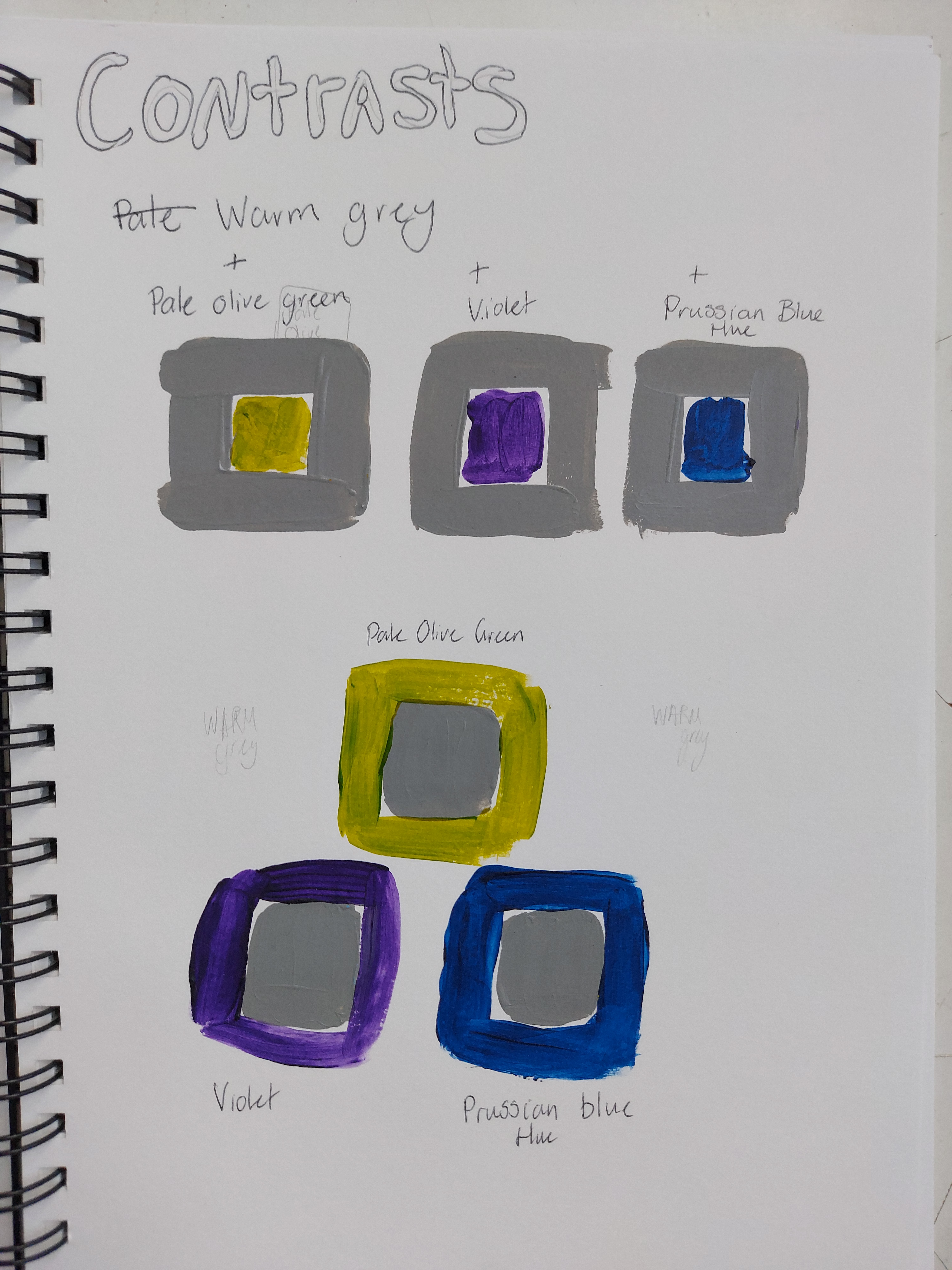
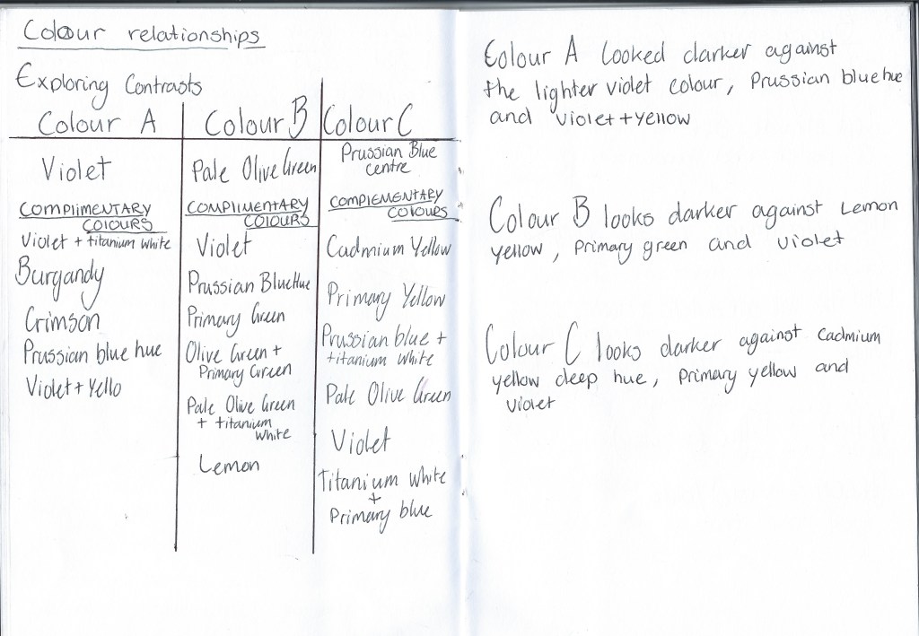
I am able to see my main colours do appear different when sorronded by colours. I have noticed that when the colour is the same hue it sharpens the colour or makes the colour appear to be darker. When using a lighter colour of simultaneous contrast it can create a almost blend of colours.
How could this affect my work?
How colour looks in a painting seems to depend on their relationship with the colours around them. If a colour or area looks muddy or dull, it is probably because it’s surrounded by colours which are too similar in hue or tone. On the other hand if the colours in a painting look bright and gorgeous, it will be because there are many juxtapositions of opposite hue and tone.
