For this exercise, I created a 12 colour wheel on an earlier prepared grey A4 page.
Firstly I painted the primary colours and secondary colours then made the tertiary colours. There are 6 tertiary colours, each made by mixing a primary colour with an adjacent secondary colour.

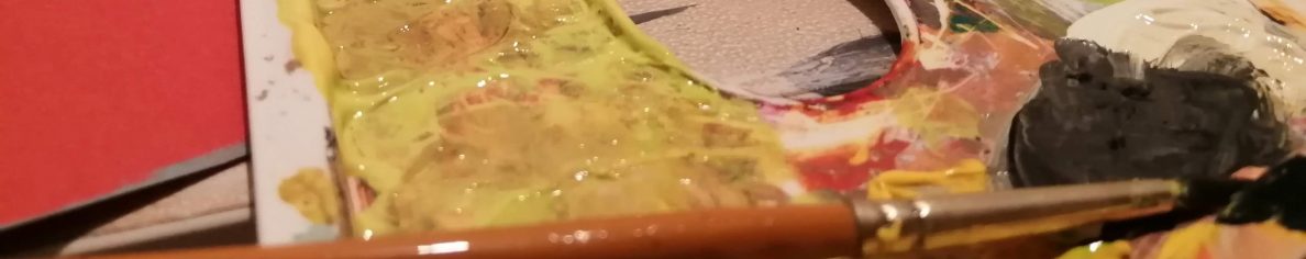
The image above shows me creating complimentary colours by choosing a colour and its opposite and mixing them 50/50

This exercise has allowed me to see the strengths of a colour and has allowed me to see different tones which I can use closely with colours to add greater depth and contrasts.
