Successive contrast is a phenomenon that is an effect of previously viewed colours. This occurs when the colour receptors in the retina are temporarily used up leaving behind an afterimage retained by your eye even after you stop viewing something. This afterimage is the complementary colour of the original colour. Below are my findings from … Continue reading Successive contrasts
Optical Effects
The Impressionists sought to capture the optical effects of light, to depict the everchanging natural world on their canvases, seen in Impressionist artists work like Gustave Caillebotte and Claude Monet. Post-Impressionists rejected interest in depicting the observed world, they instead looked to their memories and emotions in order to connect with the viewer. Structure, order, and colour are what … Continue reading Optical Effects
Linear Perspective
In basic linear perspective, there are 4 major types of perspective defined by the number of primary Vanishing Points lying on the Horizon Line. Creating a image with perspective principles allows to creator to explore realistic illusion of 3 dimensional space. References Invaluable. 2019. Understanding Linear Perspective in Art. [ONLINE] Available at: https://www.invaluable.com/blog/understanding-linear-perspective-in-art/. [Accessed 5 August 2020]. … Continue reading Linear Perspective
Michel-Eugene Chevreul
Michel-Eugene Chevreul is the author of 'The Principles of harmony and contrast of colours' a text published in 1839, its content was soon know as the laws of simultaneous colour contrast. This book is one of the first systematic studies of colour perception, contrast of colours and colour mixtures. In 'The principles of harmony and … Continue reading Michel-Eugene Chevreul
Still life with colour used to evoke mood
I straight away wanted to paint something that evoked the mood of the current climate, the world paused, cautious, fearful and uncertain. We are in a prominent time that will be in history books. Coronavirus - Covid19. To me the colours of the time speak greys, blues, green of varied tones. White reminds me of … Continue reading Still life with colour used to evoke mood
Still life with Complementary Colours
I chose a YSL Orange leather bag with a gold chain and dangles. Sitting on top of a plastic blue bag. I kept the background white but used a texture for the bottom to allow easier viewing. I sketched the image prior to painting. I enjoyed the process of creating a line image as I … Continue reading Still life with Complementary Colours
Complementary colours
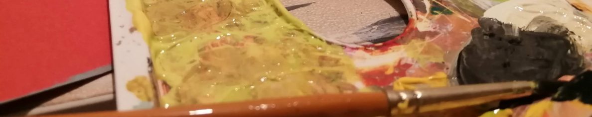
For this exercise, I created a 12 colour wheel on an earlier prepared grey A4 page. Firstly I painted the primary colours and secondary colours then made the tertiary colours. There are 6 tertiary colours, each made by mixing a primary colour with an adjacent secondary colour. The image above shows me creating complimentary colours … Continue reading Complementary colours
Chiaroscuro
Colour Accuracy
My chosen objects for this exercise, I chose these because of their solid forms, patterns and different colours. I first drew with compressed charcoal. I used a collection of white, light grey, medium dark grey, dark grey and black to create the image pictured above. This expresses the tonal value of my chosen subjects without … Continue reading Colour Accuracy
Exploring Contrasts
Here I explored how each colour can appear when surrounded by different colours Here I am exploring how pale warm grey can alter with my colours closely related. Here is a list of the colours I surrounded my main colours with and my noticed results while doing this exercise I am able to see my … Continue reading Exploring Contrasts
